


The property market endured a turbulent year in 2020, with much talk of a shift away from apartment-based city living and towards the space of the suburbs and countryside.
But is this shift reflected in the data? Using London and its surrounding counties as our test case, we take a look at whether the pandemic really has ended the allure of the city.
Has there been an exodus from the city?
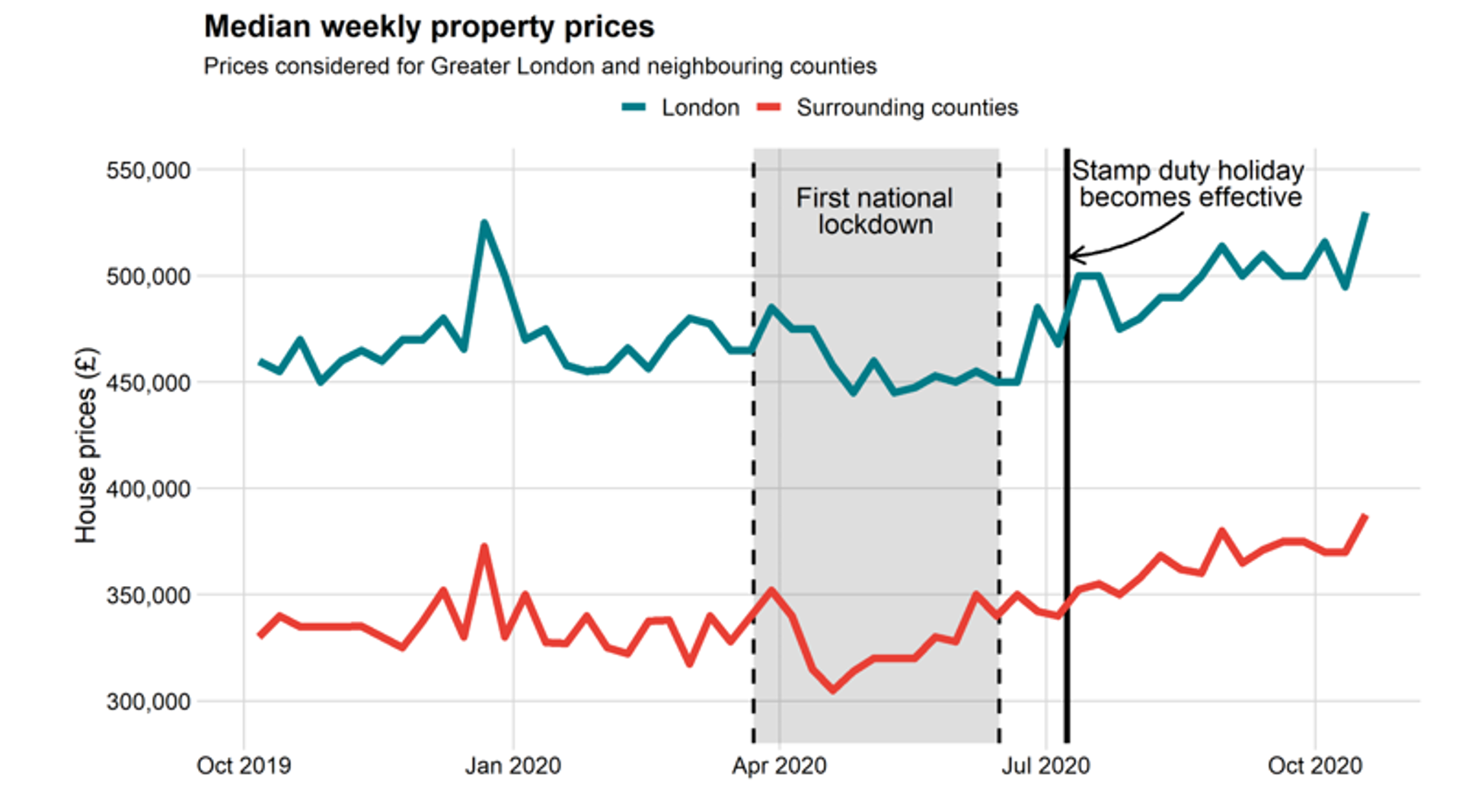
Weekly property prices
In the chart below, we’ve depicted the change in median weekly property prices for both London and its surrounding counties.
Source: Frontier analysis
We can see that the first lockdown initially triggered a price dip. But by the end of the lockdown, prices had recovered – and then went on to increase further with the introduction of the stamp duty holiday.
These trends followed a similar path both in the city and outside it, revealing no great evidence of an exodus from London.
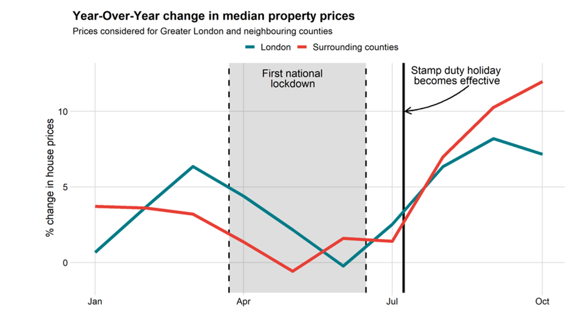
Annual price change
The change in property prices from 2019, however, tells a different story.
Source: Frontier analysis
For properties outside the city, the annual price change jumped up from -1% in May to a staggering 12% in October, with the biggest increase occurring around the introduction of the stamp duty holiday.
Properties in London increased in price too compared to the previous year, but growth was slower. By October, London prices were only up 7% on 2019.
This suggests greater demand for properties outside the city than within it.
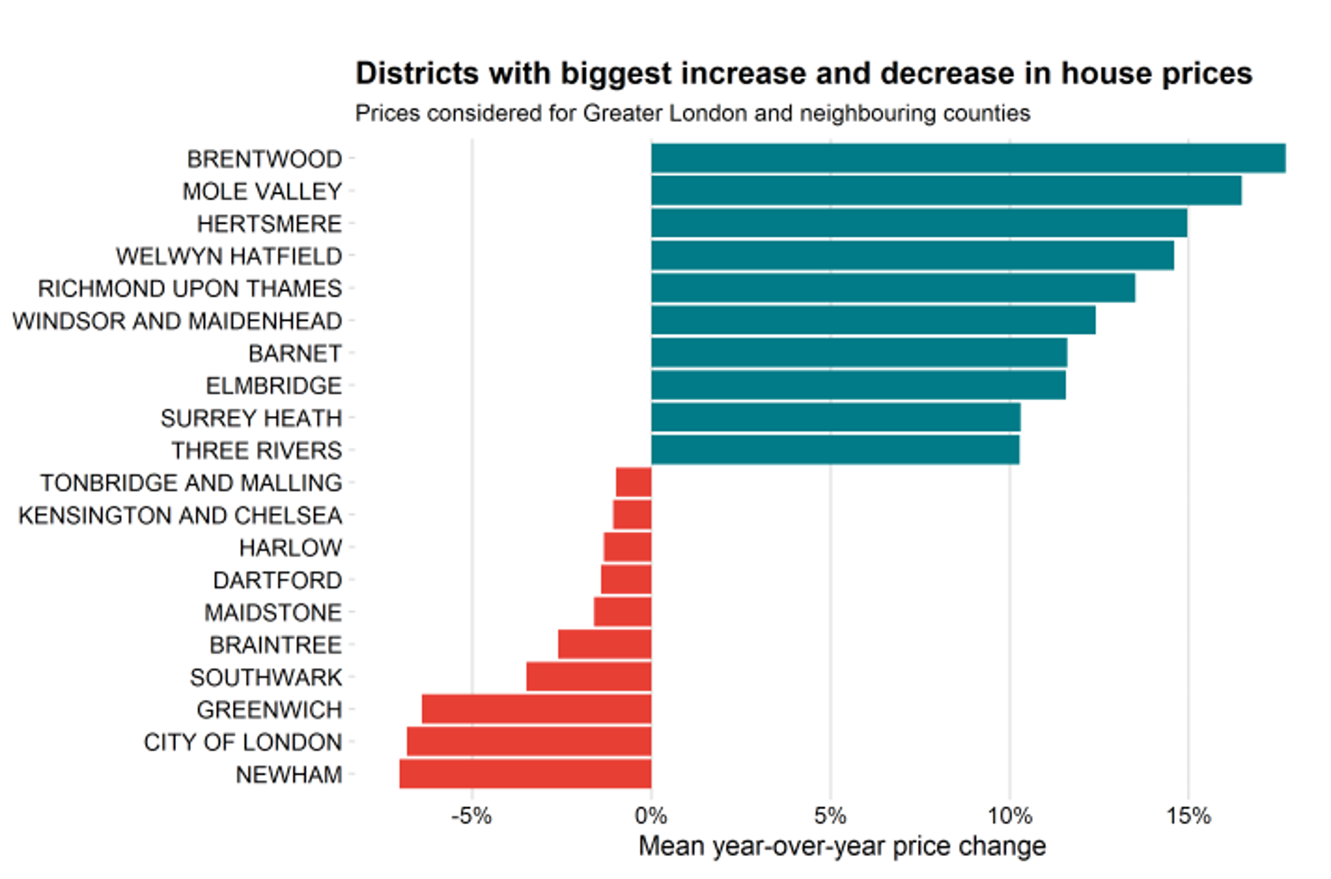
Price change district by district
There’s further evidence of increased demand outside the big city when we look at the districts with the biggest price increases and decreases.
Source: Frontier analysis
Of the 10 districts that experienced the most growth, only two are in Greater London: Richmond Upon Thames and Barnet. The region with the most rapid price growth was Brentwood in Essex, with an average year-over-year increase of more than 17%.
When it comes to areas in which prices have fallen, London accounts for the top four sharpest decreases (though the top 10 overall is an even split). As expected, the City of London was one of the hardest hit districts, with the clampdown on international travel, lack of tourists, office closures and unaffordable rents likely to have contributed to a fall in property prices of roughly 7%.
Mapping price changes in London
What can we see if we plot London price changes on a map? Certainly no uniform decline appears to be present.
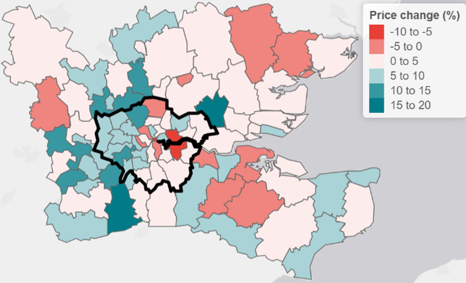
Source: Frontier analysis
But the map suggests two trends. Firstly, property prices in west London (which tends to include leafier areas with more open space) are growing at a faster rate than those elsewhere in the capital. And secondly, prices in districts bordering Greater London are growing faster than those in areas further away from London.
Number of properties sold
Another way to analyse last year’s changes is to look at the number of sales that occurred. Were more properties purchased outside the city than within it?
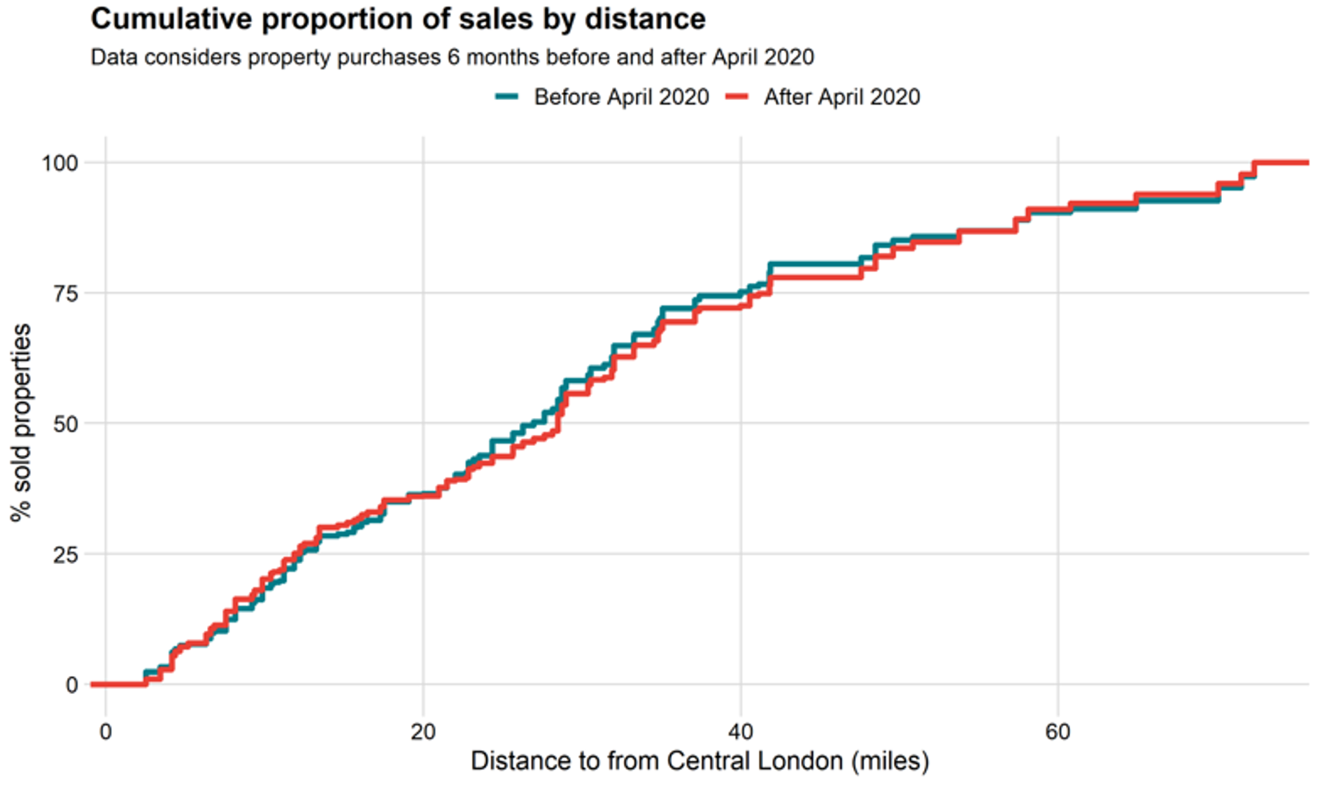
Source: Frontier analysis
The chart above shows the cumulative proportion of sales by distance away from central London. The blue line represents sales before April 2020 and the red line shows sales after April.
Whenever the red line is above the blue line, it means that properties at this distance from the centre of the capital were selling more frequently than they were before the pandemic.
Surprisingly, the proportion of properties sold within a 20-mile radius of central London was slightly higher after April than it was in the six months prior. And what’s more, properties between 20 and 60 miles away sold less frequently.
But we do see higher interest in properties more than 60 miles away from central London after the first lockdown, which suggests there was a small proportion of people willing to move substantially further away from the city.
Is the demand for flats flat?
Another aspect of the so-called shift away from city living is the type of property people want to live in.
The pandemic has forced us to spend significantly more time at home. As a result, the story goes, people have started ditching their city flats in favour of larger properties with more outdoor space. Is this reflected in the data?
Weekly sales for different property types
The chart below breaks down all sales in both London and its surrounding counties by type of property: detached house, semi-detached house, terraced house and flat.
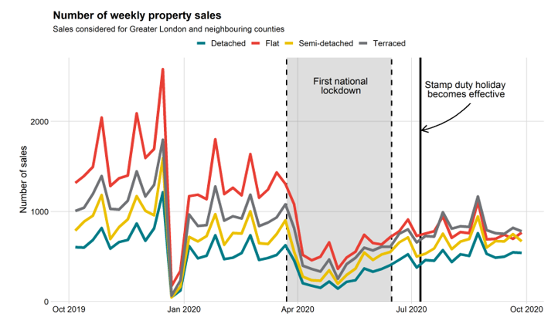
Source: Frontier analysis
It’s clear from the red line that flats represented the majority of property sales prior to the pandemic. But once the first lockdown began, flats saw the steepest decline.
What’s more, after the introduction of the stamp duty holiday, the number of flats sold was overtaken by the number of terraced houses – for the first time in recent history.
Stamp duty savings and a desire for more space are likely to have been the motivating factors for many people to seek living in a house rather than a flat.
Annual price change for different property types
Before the lockdown started, annual price trends seemed to be following a similar pattern for all property types – as can be seen in the chart below.
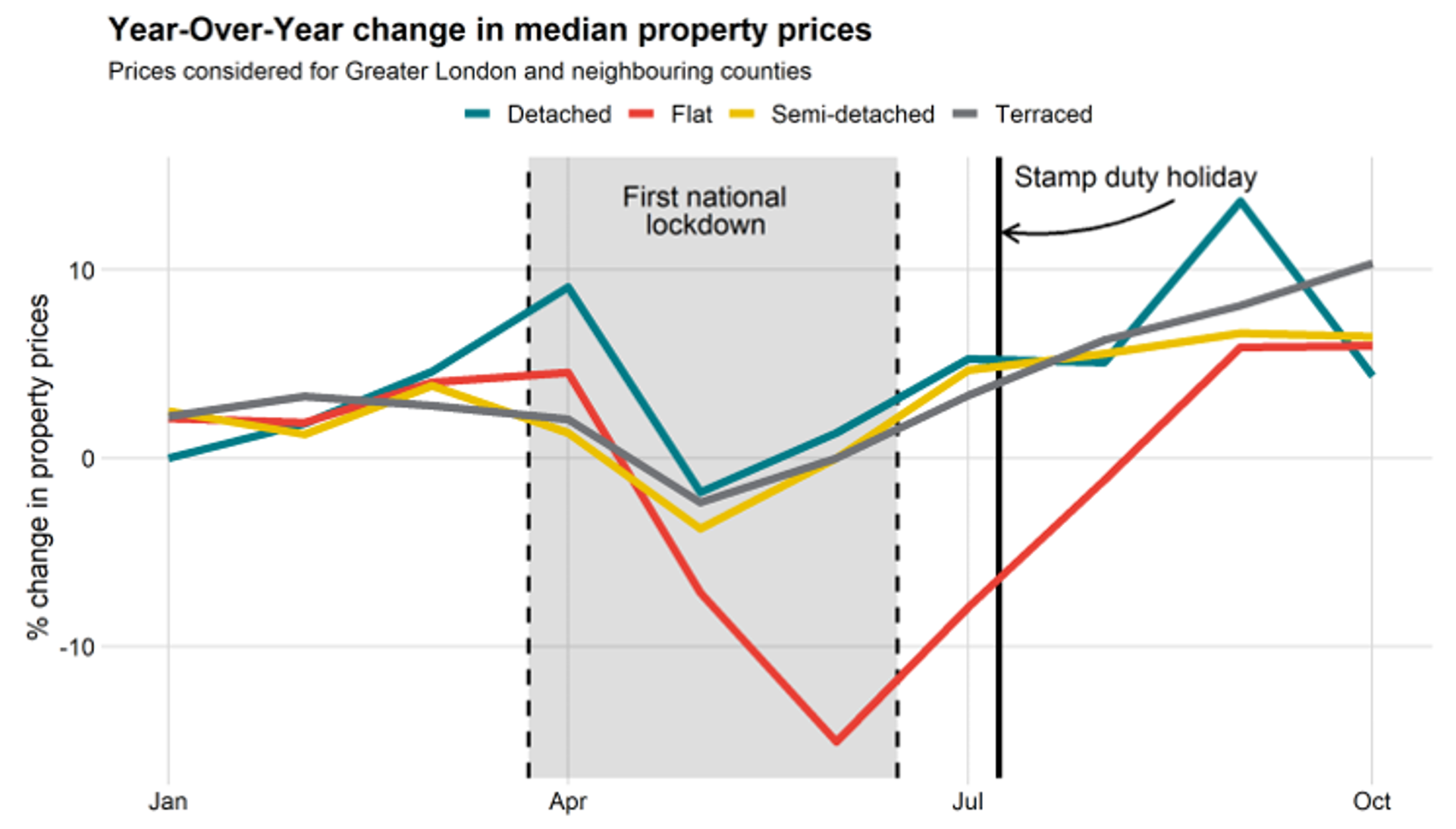
Source: Frontier analysis
But the chart also shows that, after the lockdown began, flats saw the sharpest drop in year-over-year prices. Between June 2019 and June 2020, for example, the median price of a flat fell by 15%.
This huge dip was followed by a rapid V-shaped recovery, but prior to that, the prices of flats had fallen faster and for a longer period than those of houses – which only experienced a brief contraction before a prolonged period of growth.
Who is driving the change?
As well as looking at what changes have taken place, it’s also interesting to look at the demographics behind them.
For this, GP registration data, published monthly by the NHS, can be useful. The data reports the number of registered patients, split into age bands, by healthcare area. By using this information, we can compare the flows of people moving between different areas – as people are most likely to register with a GP when permanently moving residence.
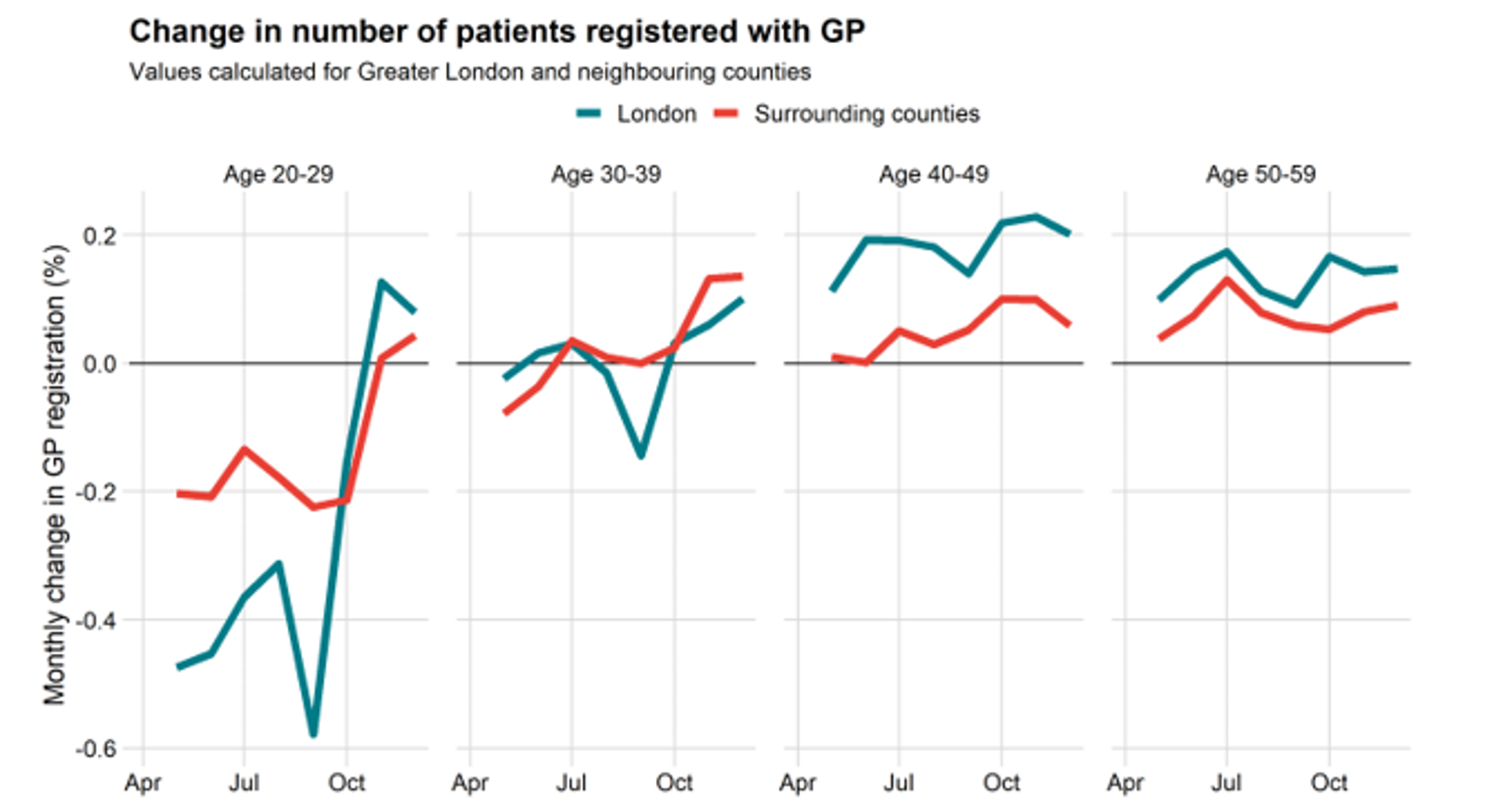
Source: Frontier analysis
In the older age groups (40–49 and 50–59), registration trends are similar both in and outside the city, suggesting no prevailing preference. This is to be expected – as people get older, they tend to relocate less often.
The biggest swings can be seen in the cohort of 20–29s. An initial trend out of the city – likely influenced by the fact that this group is predominantly made up of renters rather than owners – was quickly reversed after the end of the lockdown. This suggests those in their twenties continue to prefer London living.
The higher demand for living outside of London, therefore, is likely driven by people in their thirties. They were the only age group in which the number of GP registrations outside London overtook those within the capital.
Has there been a ‘tree change’?
So, does the data back up all the stories about people leaving their city flats for a house with a garden in the countryside?
When it comes to price data, the answer is yes – but only to a certain extent.
Property prices in the regions bordering London have experienced relatively high price growth and a distinct switch in preference away from flats and towards houses.
But our analysis suggests that there has not been a wholesale ‘tree change’. Buyers are still keen to live relatively close to central London, albeit in greener, more spacious areas.
What next for the housing market?
With increased home working set to stay, smaller flats closer to central London may have lost some of their appeal. If people vote with their feet and these trends continue, it is reasonable to expect more subdued growth for London flats relative to houses in counties bordering London.
In general, especially with the stamp duty holiday due to expire at the end of June, we’re likely to observe lower levels of demand for property over the coming months – exacerbated by rising unemployment once the furlough scheme ends in September.
Put simply, 2021 – just like 2020 – is set to be an uncertain year for the housing market.
A note on our data: To conduct this analysis, we’ve used the ‘Price Paid’ dataset collected by HM Land Registry, which records all property sales in England and Wales. This data is published with a lag of two to three months, so our analysis covers the 12 months up to November 2020.
This article is written to stimulate discussion only. Information presented in this article should not be relied upon in any way. Views presented in this article are opinions of the authors only and not necessarily views of Frontier Economics.
Covid-19
Our latest collection of articles explores the impact of Covid-19 across all of our sectors.
Discover more